Dailymotion video
streaming platform revamp
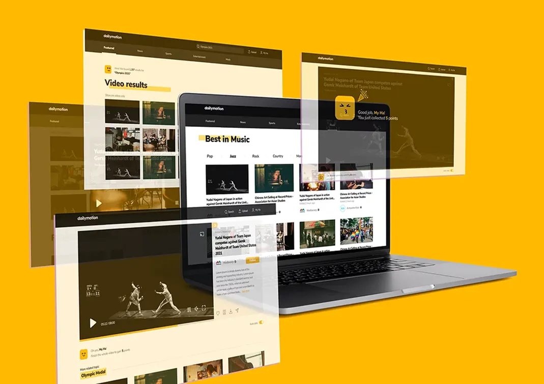
Streaming Platform Multi-devices
Personal Project - Case Study
Disclaimer: I’m not affiliated with Dailymotion in any capacity. This case study was done to enhance my experience.
Images and icons being used in UI design is from Figma and Pexel open sources.
Overview
What is Dailymotion
Dailymotion is a French video-sharing technology platform primarily owned by Vivendi. It is available worldwide in 183 languages and 43 localized versions featuring local home pages and local content. It is also one of the most popular video-sharing platforms nowadays.
The first time I've used Dailymotion is in 2010 and I actually love it. I used to watch all the k-pop shows, and cartoon from Dailymotion that I couldn’t find from my TV network or anywhere else.
What Dailymotion
After using Dailymotion for a while, I found some user flows on the website and iOS app which can be improved and made better. I think this is absolutely a good chance to enhance the UX/UI design skills so I challenged myself to improve their user experience and interface in any way I could.
Project Goal
My goal for this project is to design a better user experience through out the app so that we can promote it more to the potential user.
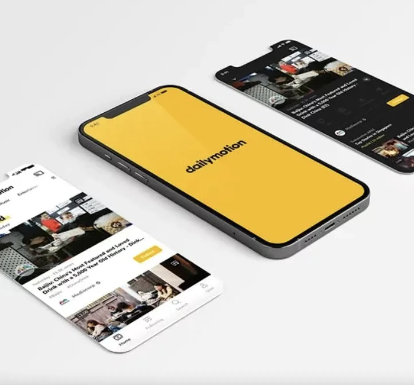
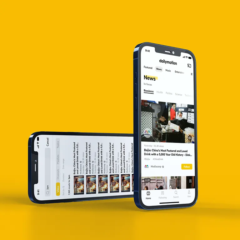
My redesign mockup
Design Thinking Process
Here is the my design thinking process. You can click on the circle to scroll to each part!
Click here if you want to go
straight to design 😁
Platform analysis
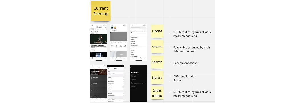
Current sitemap
To have a clearer understanding of how the site work, I listed down the sitemap structure that they have
My redesign mockup
They have 4 main pages on the app:
- Home Page which shows 5 different categories of video recommendation
- Following Page lists all the videos from the channels that you'd followed and those videos are arranged separately from each channel
- Search Page
- Library Page which helps you to save all the library and it also includes the setting section; the side menu will help you to navigate back to the categories on the Home Page
Heuristic Evaluation
At a very first glance, I found things that I like about the app:
- Clear & minimalist design theme
- Simple navigation system
- Diverse contents
- Relevant recommendations
It brings out a modern vibe and feels very neat and suitable for almost everyone to use.
Problem identification
Experiencing the platform
Here are the problems I’ve faced while experiencing the Dailymotion app:
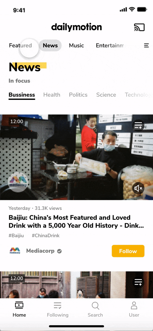
- The content on Home Page is not interesting enough because it is limited to the 5 categories
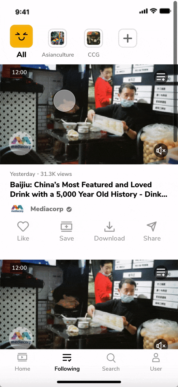
- The Following Page includes a lot of videos from my following channels list and they are arranged based on the channel's name. The thing is I can only see the video from one channel at a time and I have to switch it to see more videos from different channels I followed. It makes me feel like I'm viewing the channel page rather than the feed page. It doesn't trigger the interests inside me and makes me want to continue surfing that page
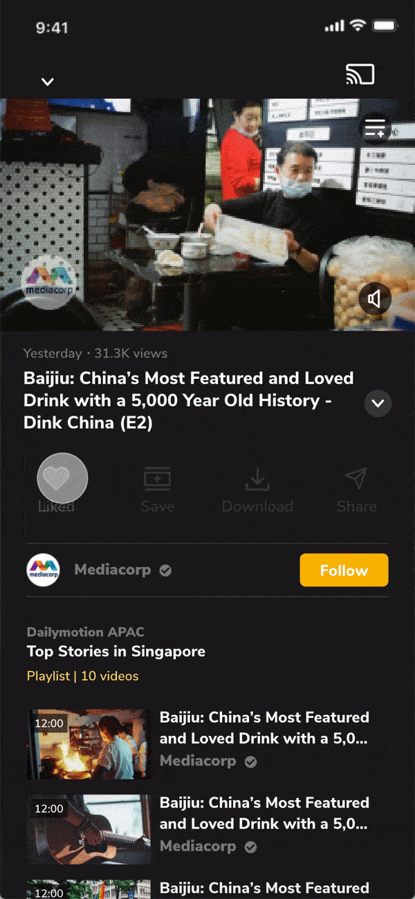
- The thumbnail in Video Listing Page doesn't have Save for Later option. I need to go to the Video Detail Page to select the Save for later option
- The Library icon on the Navigation Bar looks like the User Icon and when I click on that, it drives me to Library Page
- No User Page. I can't find a User Page to manage my information. I only can do that when I go to Library Page then click on the Setting button which doesn't make sense. The symbol for Library page is the user icon which is not appropriately used.
- Lack of engagement factors throughout
- Might consider to have a small change in color scheme
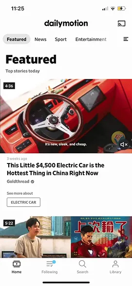
The current mobile app on IOS of Dailymotion (September 2021)
Problem statements – “How might we” statement
In order to enhance the user experience:
- How might we make the contents more diverse and appropriately organized?
- How might we enhance the user experience on Following Page?
- How might we improve the convenience for the users while they're surfing the Home Page?
- How might we standardize the icons and text being used in the navigation bar?
- How might we help the user have more control to their information throughout the app?
- How might we encourage the users using the app more?
- How might we boost Dailymotion branding identity?

Suggested solutions
After understanding about the problems, now it’s time to work on the solutions. Here are some suggested solutions that I came up with to solve the problems listed above:
- Break down the 5 big categories into more sub-categories to have the content organized. This will ease out the process of finding videos
- Add the "ALL" tab on the following page where the users can see all the videos from different channels that they have followed. All the videos will be organized base on the uploaded timestamp. The latest video will be on the top, and the older ones will be following below. This will help the users constantly seeing new and fresh content
- Add Save for later option onto the video thumbnail
- Change Library Page into User Page and also put the user information inside this Page so that the user can manage anytime they want
- Adjust the size and the alignment of the video thumbnail
- Instead of the autoplay function, show 1 or 2 suggestions in the ending screen
- Add a main color to boost brand identity
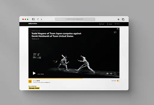
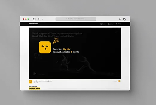
- Add new function "Watch more videos, gain more points" means the more videos they watch, the more points they get and they can also use the points to get the premium package to skip limited advertisement inside the platform. For unlimited ads skip, we can develop on different packages or member plans so that the user can choose from. This will help the platform become more engaging and also can have a little boost to the business aspect
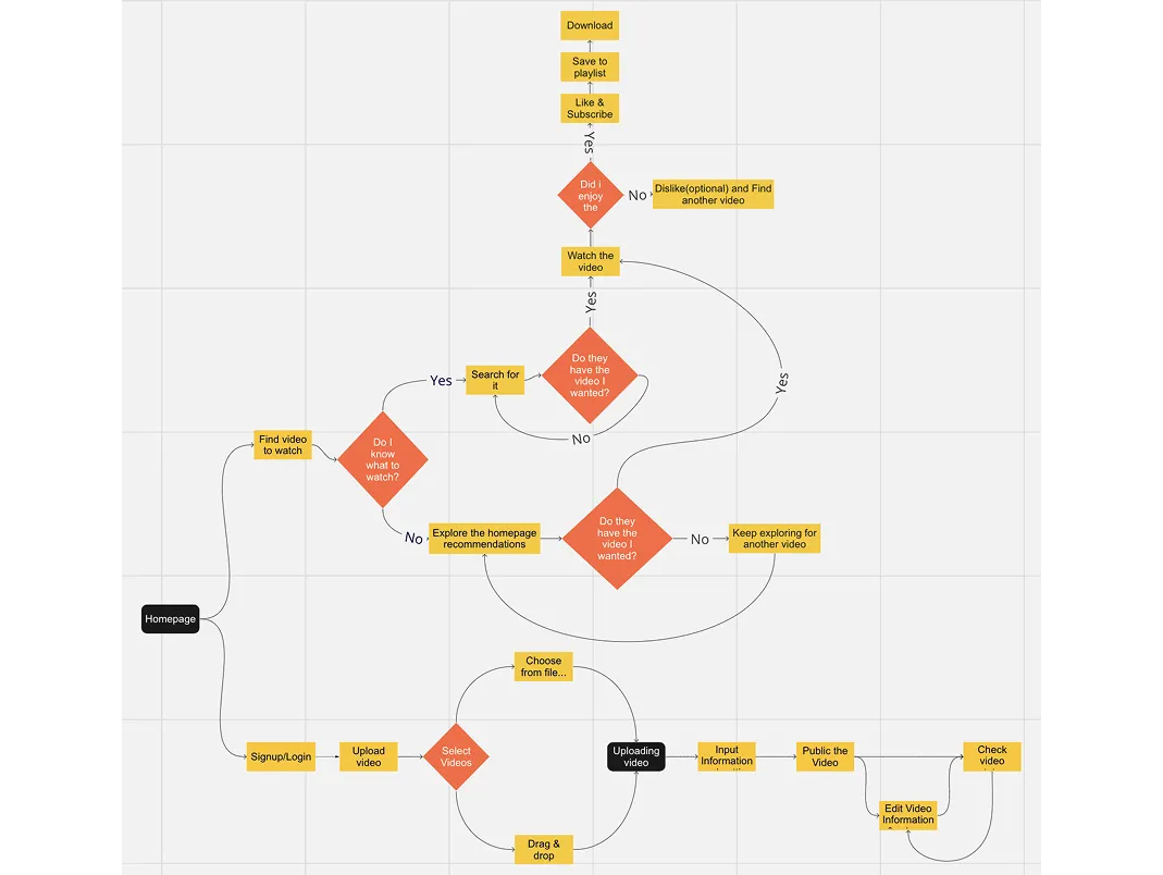
User Flow
There are two main actions in Dailymotion:
- Watching video
- Uploading video
Dailymotion mobile version is more likely to focus on consuming content rather than creating content and the mobile app doesn’t have the video uploading function. Hence, in this project, i will focus more on improving the UX of consuming content.
The current mobile app on IOS of Dailymotion (September 2021)
The current mobile app on IOS of Dailymotion (September 2021)
The current mobile app on IOS of Dailymotion (September 2021)
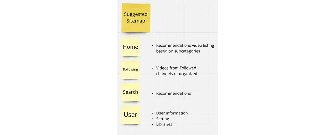
Suggested sitemap
Here is the sitemap that i propose:
Wireframe
Here is the sitemap that i propose:
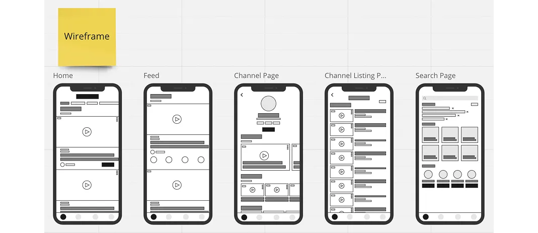
Mobile phone app wireframe
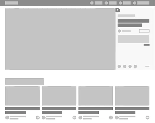
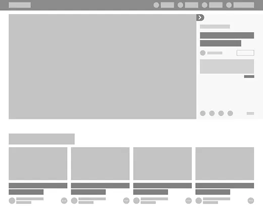
Desktop website wireframe
Mobile Website Design
Home page This is the new Home Page where people can explore various categories and recommendations of videos from Dailymotion.
Video Detail Page, Video Listing Page and Channel Detail Page
Search Page and User Page
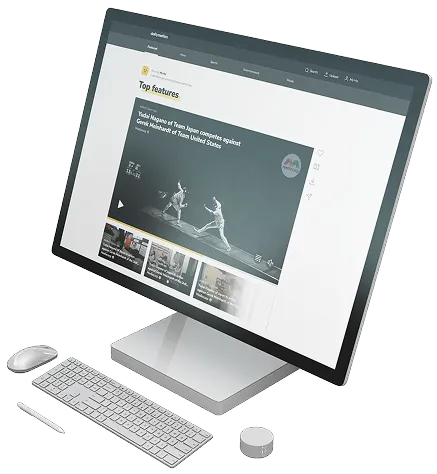
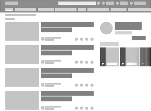
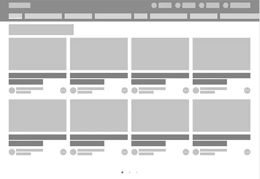
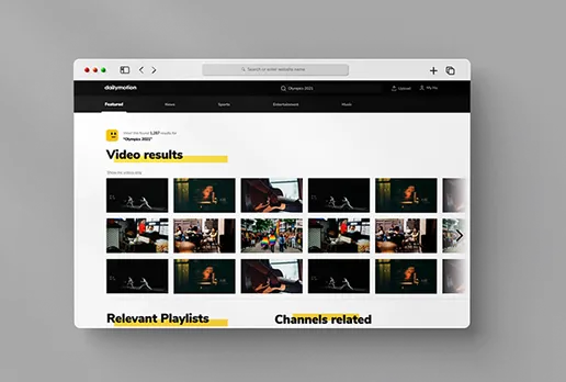
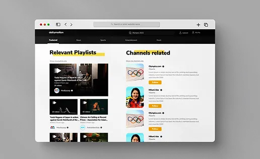
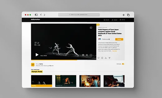
Desktop website version

Conclusion
Project Summary
More experience, both in UX and UI, I would say.
In order to accomplish this project, I have identified the pain points from the current app and base on that, I came out with my solutions for the new flow and visual. I believe that helps improve the experience for existing users as well as get more attraction from new/old users of the platform.
And during the whole process, I’ve enhanced my XD skills. I have learned how to use components, color assets, and text style to speed up the interface design process. I also learned to use animation to make the transition from one page to another smoother.
Moving ahead, I will test the usability of this new version of Dailymotion and keep it updated better and better.
Other Projects


Ready to Craft User-Centric Solutions Together?
Website designed and owned by Myha
Developed by Huy Le & Ho & Quan